
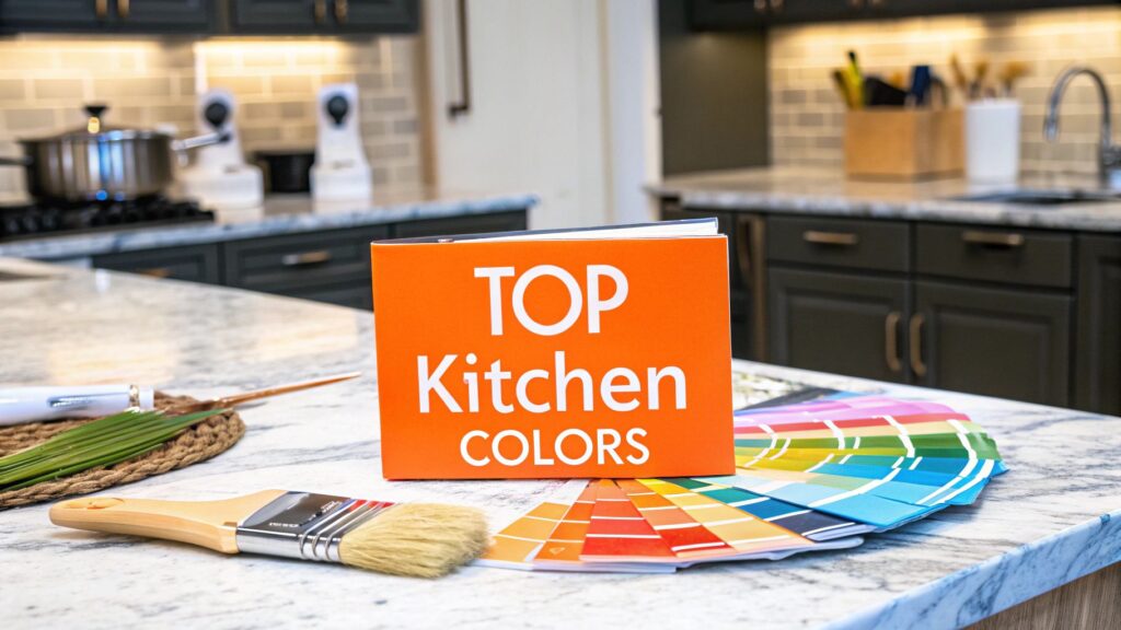
The heart of your Orange County home deserves a color palette that reflects both your personal style and the latest in design innovation. Selecting from the best colors to paint a kitchen is a critical step in any remodel, capable of transforming the space from merely functional to truly extraordinary. A well-chosen color scheme can make your kitchen feel larger, brighter, and more inviting, directly impacting your home’s aesthetic appeal and your daily enjoyment. For discerning homeowners in Newport Beach, Irvine, and across Southern California, getting this foundational detail right is paramount to achieving a high-end result that stands the test of time.
As an IICRC Master Certified firm and a BBB Torch Award-winning Licensed General Contractor, we at Sparkle Restoration Services understand that color is the cornerstone of exceptional design. The natural light in your kitchen significantly influences how colors appear; for ways to enhance it, discover inspiring kitchen skylight ideas that can transform your space and style. This expert guide moves beyond fleeting trends to provide actionable insights into sophisticated palettes that define luxury and functionality. Let's explore the top color schemes that deliver enduring style, enhancing both your lifestyle and your Orange County property's value for years to come.
1. Classic White and Cream
A classic white and cream palette remains one of the best colors to paint a kitchen for its timeless elegance and unparalleled versatility. This color scheme uses shades of white or soft cream for cabinetry and walls, creating a bright, clean, and airy atmosphere. By reflecting natural and artificial light, this palette makes even compact kitchens feel more expansive and open.
This foundational neutrality, seen in everything from modern Scandinavian designs to luxurious custom homes, serves as a perfect canvas. It allows for effortless updates through accessories, textiles, and hardware, adapting to evolving styles without requiring a complete overhaul.
Why It Works for High-End Kitchens
For discerning homeowners, a white or cream kitchen provides a sophisticated backdrop that highlights premium materials and impeccable craftsmanship. It is the ultimate choice for a kitchen that is both beautiful and functional, designed to enhance your home’s value and aesthetic appeal for years to come. Explore how this palette was expertly applied in a stunning kitchen remodel in Huntington Beach, CA.
Pro Tips for Implementation
- Warmth is Key: Avoid stark, clinical whites. Opt for warmer tones like ivory, alabaster, or Swiss coffee to create a more inviting and welcoming space.
- Layer Textures: Combine matte-finish cabinetry with a glossy backsplash or polished stone countertops. This layering adds visual depth and prevents the monochrome scheme from feeling flat.
- Incorporate Natural Elements: Introduce warmth and contrast with natural wood accents, such as open shelving, a butcher block island, or hardwood flooring.
- Use High-Quality Paint: Select a premium, durable paint with a satin or semi-gloss finish for cabinetry and trim. These finishes are stain-resistant and easy to clean, ensuring your kitchen remains pristine.
2. Warm Gray and Taupe
Warm gray and taupe offer a sophisticated, modern alternative to traditional neutrals, establishing a cozy yet refined ambiance. This palette masterfully bridges the gap between cool whites and earthy tones, using warm-based grays and rich taupes for cabinetry, walls, or islands. The result is a kitchen that feels contemporary, balanced, and incredibly inviting.
This color scheme, championed by leading designers and color experts, provides depth and character without overwhelming the space. Its versatility makes it suitable for everything from sleek, modern apartments to transitional homes, pairing seamlessly with a wide range of materials and finishes.
Why It Works for High-End Kitchens
For homeowners seeking a chic and enduring look, a warm gray and taupe kitchen delivers understated luxury. This palette accentuates high-end finishes like polished nickel hardware, quartz countertops, and custom woodwork, creating a layered and thoughtfully designed environment. It's an ideal choice for a kitchen that feels both current and timeless. See how our experts integrate sophisticated palettes with our premium design-build services.
Pro Tips for Implementation
- Select the Right Undertones: Choose warm grays with subtle brown or beige undertones, like Sherwin-Williams' Modern Gray, to avoid a cold or sterile feel.
- Create Contrast with Trim: Frame gray cabinetry or walls with crisp white trim to make the primary color pop and add architectural definition.
- Layer with Natural Materials: Introduce warmth and texture by incorporating natural wood elements, such as flooring, open shelves, or a butcher block island.
- Incorporate Metallic Accents: Elevate the palette with hardware and fixtures in warm metals like brushed brass, gold, or copper for a touch of glamour.
3. Navy Blue and White Coastal
A Navy Blue and White Coastal palette brings timeless seaside sophistication to the heart of the home, making it one of the best colors to paint a kitchen. This classic combination pairs deep, rich navy blue with crisp, clean white to create a balanced, nautical-inspired atmosphere. Often seen in luxurious Hamptons-style homes and coastal retreats, this scheme feels both elegant and refreshingly calm, perfectly suited for Orange County living.
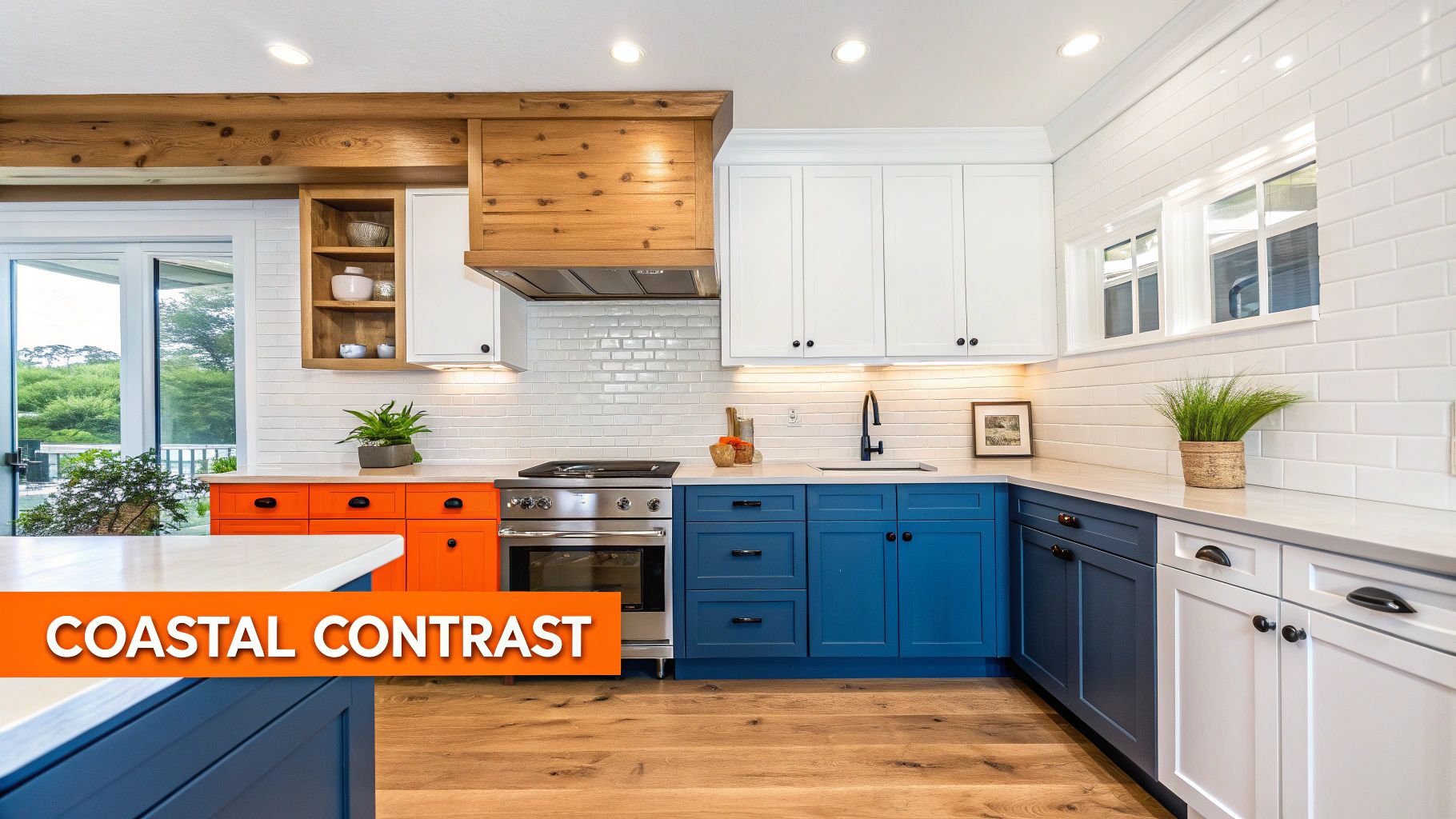
The strong contrast between the dark navy and bright white creates a dynamic yet harmonious look. This palette is incredibly versatile, fitting seamlessly into both traditional and contemporary kitchen designs while evoking a sense of tranquil, upscale coastal living.
Why It Works for High-End Kitchens
For homeowners seeking a design that is both bold and classic, a navy and white kitchen delivers a powerful statement of refined taste. The deep navy provides a luxurious anchor that beautifully showcases premium materials like marble countertops, custom cabinetry, and polished hardware. This high-contrast aesthetic elevates the space, creating a bespoke environment that is perfect for both everyday living and sophisticated entertaining, enhancing your home’s distinctive character and value.
Pro Tips for Implementation
- Create Balance: Use navy on lower cabinets or a central island and keep upper cabinets white. This two-toned approach grounds the space without overwhelming it and maintains an airy feel.
- Illuminate the Space: Since navy is a dark color, ensure the kitchen has ample lighting. Incorporate bright task lighting under cabinets and elegant pendant lights over the island.
- Choose Light Surfaces: Pair navy cabinets with light-colored countertops and a bright backsplash, such as white marble or a glossy subway tile, to reflect light and enhance the contrast.
- Select Premium Hardware: Complement the color scheme with high-end hardware. Polished nickel or satin brass pulls and knobs add a touch of warmth and luxury against the deep blue.
4. Sage Green and Natural Wood
Embracing a nature-inspired aesthetic, a sage green and natural wood palette brings organic tranquility into the heart of the home. This combination uses soft, muted green on cabinetry or walls, beautifully complemented by the warmth of natural wood elements. The result is a kitchen that feels both grounding and sophisticated, reflecting a growing desire for wellness and botanical influences in high-end interior design.
This color scheme strikes a perfect balance between a distinct personality and timeless appeal. It is one of the best colors to paint a kitchen for homeowners seeking a serene yet modern environment. The earthy tones create a welcoming atmosphere that is both refreshing and comforting, ideal for a space that serves as both a culinary workshop and a family hub.
Why It Works for High-End Kitchens
For the discerning Orange County homeowner, a sage green and wood kitchen offers a unique and refined alternative to more common palettes. It provides a custom, designer feel that highlights natural materials and thoughtful craftsmanship. This choice signifies an appreciation for grounded luxury, creating an elegant space that promotes calm and connection, enhancing both your home's ambiance and its overall value.
Pro Tips for Implementation
- Select the Right Sage: Choose a soft, muted sage with gray or blue undertones. Avoid overly bright or minty greens to maintain a sophisticated and calming feel.
- Balance Wood Tones: Pair sage green with light-toned woods like white oak, birch, or maple for a modern, airy Scandinavian look.
- Contrast with Countertops: Use crisp white or soft cream quartz or marble countertops to provide a clean contrast that makes the green and wood tones pop.
- Incorporate Warm Metals: Elevate the design with hardware and fixtures in brushed gold, champagne bronze, or unlacquered brass to add a touch of warmth and luxury.
- Layer in Natural Textures: Introduce a natural stone backsplash, such as honed travertine or limestone, to add another layer of organic texture and visual interest.
5. Two-Tone: Dark Lower with Light Upper
A two-tone cabinet scheme, featuring darker lower cabinets paired with lighter uppers, is one of the best colors to paint a kitchen for creating a custom, high-end look. This popular design trend grounds the space with a rich, deep hue on the base cabinetry while keeping the upper portion feeling bright, open, and airy. The result is a sophisticated and visually dynamic kitchen that avoids feeling either too heavy or too stark.
This approach offers the perfect balance, delivering visual interest and depth without overwhelming the room. It’s a versatile choice that complements transitional, modern, and contemporary aesthetics, allowing homeowners to play with color in a structured and intentional way.
Why It Works for High-End Kitchens
For discerning homeowners, a two-tone kitchen signals a thoughtfully designed space that moves beyond standard, single-color layouts. It creates an opportunity to highlight premium countertops and unique hardware while adding a layer of architectural interest. This layered aesthetic makes a kitchen feel custom and professionally curated, enhancing both its functionality and its value. See how this sophisticated approach was used in a comprehensive kitchen and bathroom upgrade in Irvine, CA.
Pro Tips for Implementation
- Create Cohesion with Undertones: Ensure the dark and light colors share a similar undertone (cool or warm) to create a harmonious, unified look.
- Unify with Hardware: Use the same style and finish of hardware on both upper and lower cabinets to tie the two distinct color zones together.
- Consider Open Shelving: Replace some or all upper cabinets with open shelving in a light wood or white finish to maximize the sense of spaciousness.
- Balance with a Neutral Countertop: Select a single countertop material to run across all base cabinets. This creates a cohesive horizontal line that unifies the design.
6. Black and Stainless Steel Modern
A black and stainless steel palette brings a bold, sophisticated energy to the kitchen, creating a sleek and professional aesthetic. This contemporary color scheme pairs dark charcoal or true black cabinetry with the cool, industrial feel of stainless steel appliances, countertops, and hardware. The result is a dramatic, high-contrast look often seen in modern luxury homes and inspired by professional restaurant kitchens.
This commanding combination works best in well-lit spaces where its depth can be fully appreciated. It creates a powerful architectural statement, making it one of the best colors to paint a kitchen for homeowners seeking a modern, edgy, and luxurious atmosphere that is both timeless and undeniably current.
Why It Works for High-End Kitchens
For homeowners with a refined, modern taste, a black and stainless steel kitchen delivers an unparalleled sense of sophistication. This palette highlights clean lines, minimalist design, and premium materials, turning the kitchen into a functional work of art. The deep, rich tones of black cabinetry provide a stunning backdrop for high-end stainless steel appliances, elevating the entire space. See how this modern aesthetic was achieved in a stunning restoration and kitchen remodel in Irvine, CA.
Pro Tips for Implementation
- Soften with Matte Finishes: Opt for matte black cabinetry instead of high-gloss to reduce glare and create a more approachable, less industrial feel. A matte finish also helps hide fingerprints.
- Introduce Warmth: Balance the coolness of steel and black with natural wood elements, such as a butcher block island, open shelving, or warm-toned flooring.
- Strategic Lighting: Incorporate warm, layered lighting. Under-cabinet LEDs, statement pendant lights, and dimmers are essential to prevent the space from feeling too dark or clinical.
- Balance with Lightness: Use light-colored flooring or a pale wall color to provide visual relief and prevent the dark palette from overwhelming the room. White or light gray quartz countertops can also offer a striking contrast.
7. Warm Wood Tones and Terracotta
A palette of warm wood tones and terracotta brings a grounded, earthy elegance to the kitchen, creating an atmosphere that is both inviting and authentically rustic. This scheme, inspired by Mediterranean, Tuscan, and Spanish-colonial design, pairs rich, natural wood cabinetry with the sun-baked warmth of terracotta-colored walls or accents. The result is a kitchen that feels deeply connected to nature and traditional craftsmanship.
This color combination celebrates texture and organic materials, moving away from sleek, minimalist trends toward a more layered and soulful aesthetic. When exploring palettes like this, it is helpful to draw inspiration from collections that embody rich earthy and organic tones. It is a perfect choice for creating a cozy, welcoming heart of the home.
Why It Works for High-End Kitchens
For homeowners seeking a unique and sophisticated design, this palette offers a departure from more common color schemes. It highlights artisanal quality, from custom wood cabinetry to handcrafted tiles, creating a bespoke environment that feels both luxurious and lived-in. This approach aligns perfectly with homes that feature rustic stone or handcrafted architectural details, providing a seamless and elevated design experience.
Pro Tips for Implementation
- Select Rich Woods: Opt for warm wood species like walnut, cherry, or quarter-sawn oak for cabinetry to establish a rich, foundational warmth.
- Balance with Terracotta: Use terracotta paint on an accent wall or island base to introduce warmth without overwhelming the space. Pair it with neutral cream or beige walls for balance.
- Embrace Natural Flooring: Enhance the aesthetic with rustic materials underfoot. Explore options for custom flooring sales and installation to find the perfect clay tile or natural stone.
- Incorporate Authentic Materials: Use handcrafted ceramic tiles for the backsplash, and consider copper or oil-rubbed bronze for hardware and fixtures to complement the warm tones.
- Layer with Warm Lighting: Install lighting with a lower color temperature (2700K-3000K) to amplify the cozy, sun-drenched feel of the space.
8. Deep Emerald Green and Brass
For a truly dramatic and luxurious statement, a deep emerald green and brass palette is one of the best colors to paint a kitchen. This jewel-toned scheme pairs rich, saturated green cabinetry or walls with the warm, reflective glow of brass or gold hardware. The result is a kitchen that feels opulent, sophisticated, and full of personality, evoking the ambiance of a high-end boutique hotel or custom-designed estate.
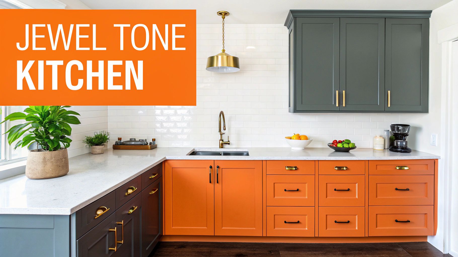
Popularized by luxury interior designers and featured in high-end design publications, this combination moves beyond fleeting trends to offer timeless glamour. It creates a bold focal point in the home, turning the kitchen into a distinctive and memorable space that confidently reflects a sophisticated design sensibility.
Why It Works for High-End Kitchens
For discerning homeowners in communities like Newport Beach or Laguna Niguel, an emerald and brass kitchen signals an appreciation for bold, bespoke design. This palette expertly highlights premium materials like marble countertops and custom-milled cabinetry, creating an environment that is both visually stunning and deeply personal. It is the perfect choice for a kitchen designed to be a showpiece.
Pro Tips for Implementation
- Balance with Neutrals: Use emerald on lower cabinetry or a single accent wall, and pair it with white, cream, or light gray upper cabinets or walls to keep the space from feeling too dark.
- Layer in Lighting: Ample task and ambient lighting are crucial. Under-cabinet LEDs, statement pendants, and sconces will highlight the richness of the green and make the brass fixtures shine.
- Choose the Right Finish: A matte or satin finish on emerald cabinetry offers a modern, velvety sophistication that minimizes fingerprints and enhances the color's depth.
- Incorporate Natural Textures: Introduce warmth and an organic feel with natural wood elements, such as a butcher block island top, open shelving, or hardwood floors, to balance the jewel tones.
9. Charcoal Gray and Warm White Transitional
A transitional palette of charcoal gray and warm white is an increasingly popular choice for a sophisticated kitchen that masterfully blends modern and traditional design. This scheme pairs deep, dramatic charcoal on cabinetry or an accent wall with the softness of warm white on surrounding surfaces. The result is a balanced, high-contrast look that feels both contemporary and timeless.
This color combination, often seen in designer-curated makeovers and contemporary farmhouse kitchens, provides a strong architectural foundation. It allows for rich layering with natural wood elements, warm metallic hardware, and textured textiles, creating an environment that is inviting, dynamic, and refined.
Why It Works for High-End Kitchens
For discerning Orange County homeowners, this transitional palette offers a chic alternative to an all-white kitchen without sacrificing brightness or sophistication. It highlights premium materials like quartz countertops and custom cabinetry, adding depth and character. This choice signifies a modern yet enduring aesthetic, perfect for a home that values both impeccable style and inviting warmth.
Pro Tips for Implementation
- Choose the Right White: Avoid cool, stark whites. Instead, opt for warm whites like ivory or alabaster to complement the charcoal and prevent the space from feeling too sterile.
- Incorporate Natural Wood: Add warmth and organic texture with a butcher block island, open shelving in a light oak, or wide-plank wood flooring.
- Warm Up with Hardware: Select hardware in brushed gold, bronze, or copper finishes. These warm tones stand out beautifully against charcoal and tie the entire design together.
- Balance with Light: If using charcoal on lower cabinets, keep the upper cabinets and walls a warm white to maintain an open, airy feel and draw the eye upward.
Top 9 Kitchen Color Schemes Comparison
| Style | 🔄 Complexity | ⚡ Resources & Cost | 📊 Expected outcomes (⭐) | 💡 Ideal use cases | ⭐ Key advantages |
|---|---|---|---|---|---|
| Classic White and Cream | Low — simple repaint/refacing | Low — widely available materials | 📊 Bright, airy, enlarges visual space — ⭐⭐⭐⭐ | Small kitchens, rentals, minimalist & versatile schemes | Timeless; easy to update; maximizes light |
| Warm Gray and Taupe | Medium — careful undertone selection | Medium — mid-range paints/finishes | 📊 Sophisticated neutral look; forgiving than white — ⭐⭐⭐⭐ | Contemporary homes, designer updates, transitional spaces | Upscale appearance; hides imperfections; versatile accents |
| Navy Blue and White Coastal | Medium — contrast planning + lighting | Medium — quality paint + lighting upgrades | 📊 Bold contrast, defined focal points; can feel dramatic — ⭐⭐⭐ | Beach homes, coastal renovations, accent focal areas | Distinctive nautical aesthetic; strong visual impact |
| Sage Green and Natural Wood | Medium — color & material coordination | Medium — paint + quality wood elements | 📊 Calming, biophilic feel; contemporary trend — ⭐⭐⭐⭐ | Wellness-focused homes, farmhouses, nature-inspired designs | Promotes calm; pairs well with wood; hides minor flaws |
| Two-Tone: Dark Lower with Light Upper | Medium–High — careful color balance | Medium — paint + consistent hardware | 📊 Adds depth and sophistication; designer feel — ⭐⭐⭐⭐ | Transitional and contemporary kitchens, large layouts | Visual dimension; hides lower-cabinet wear; flexible combos |
| Black and Stainless Steel Modern | High — precise finishes & appliances | High — premium appliances/finishes | 📊 Dramatic, professional aesthetic; high-end look — ⭐⭐⭐⭐ | High-end modern kitchens, urban lofts, statement renovations | Sleek, upscale, hides some stains; pairs with modern appliances |
| Warm Wood Tones and Terracotta | Medium — material sourcing + lighting | Medium — quality wood & tiles | 📊 Warm, inviting, rustic authenticity — ⭐⭐⭐⭐ | Mediterranean, Tuscan, rustic or gathering-focused kitchens | Inviting warmth; ages gracefully; complements natural materials |
| Deep Emerald Green and Brass | High — bold color + metallic finishes | High — premium paint & brass hardware | 📊 Luxurious, high-impact focal design — ⭐⭐⭐⭐ | High-end showrooms, luxury homes, feature cabinetry | Dramatic, memorable, pairs excellently with brass & marble |
| Charcoal Gray and Warm White Transitional | Medium — balance dark/light & warm tones | Medium — quality paints, warm hardware | 📊 Balanced, timeless transitional result — ⭐⭐⭐⭐ | Transitional homes, contemporary farmhouse, designer makeovers | Bridges styles; sophisticated yet flexible; hides wear effectively |
Bring Your Vision to Life with Orange County's Trusted Experts
Selecting a color palette is the exciting first step in your kitchen’s transformation. As we’ve explored, the best colors to paint a kitchen depend entirely on your home’s architecture, your personal style, and the atmosphere you wish to create. From the timeless elegance of classic white and warm gray to the bold sophistication of emerald green and charcoal, each choice offers a unique canvas for your daily life.
The true success of your project, however, lies not just in the color you choose, but in the precision of its execution. A premium paint job requires more than just a brush and roller; it demands meticulous surface preparation, expert knowledge of finishes, and an unwavering commitment to detail. This is where a design-build approach elevates a simple paint job into a lasting investment.
From Inspiration to Impeccable Reality
Translating a design vision into a flawless final product is a complex process. Consider these key takeaways from our guide:
- Lighting is Paramount: The way natural and artificial light interacts with a color can dramatically alter its appearance. A soft sage green might feel airy and bright in a sun-drenched Newport Beach kitchen but could appear muted in a space with less light. Professional evaluation ensures your chosen color looks perfect at all times of day.
- Finish Defines the Mood: The sheen of your paint, from matte to high-gloss, impacts durability and style. A matte finish on charcoal gray cabinets can create a sophisticated, modern look, while a satin finish on classic white offers practical cleanability for a busy family kitchen.
- Cohesion is Key: Your kitchen color must harmonize with adjacent rooms, flooring, countertops, and hardware. A skilled design team ensures every element works together, creating a seamless and intentional design flow throughout your home.
Why Expert Execution Matters for Your Orange County Home
For discerning homeowners in communities like Irvine and Laguna Niguel, a kitchen remodel is about enhancing both lifestyle and property value. Achieving a luxury finish requires a partner who understands the nuances of high-end materials and sophisticated design. This is where Sparkle Restoration Services sets the standard. As an IICRC Master Certified firm and a licensed general contractor, we bring a level of technical expertise and ethical commitment, recognized by our BBB Torch Award, that is unmatched in Orange County. We don’t just apply paint; we create perfectly balanced, expertly crafted environments. Our integrated design-build process ensures every detail, from the initial color consultation to the final brushstroke, is managed with precision, turning chaos into calm and your vision into a stunning reality.
Ready to transform your kitchen with unparalleled craftsmanship and a team you can trust? Contact Sparkle Restoration Services today to schedule your complimentary design consultation. Let us show you how our expertise can bring your vision for the best kitchen colors to life with a flawless, luxury finish.
Ready to create a space that’s as beautiful as it is functional? Schedule your complimentary design consultation today by visiting Ready to Work with Sparkle?